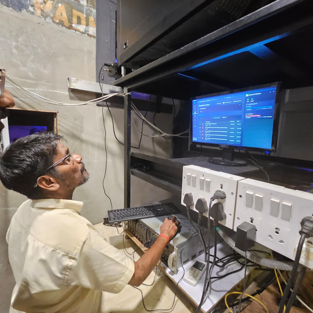
A projection booth interface, rebuilt from 2005
The setup
Qube XP is the digital cinema server in every theatre hall — it decrypts movie files, builds show playlists, and drives the projector. Deployed to 3,000+ theatre screens across India, it's the foundation the company was built on.
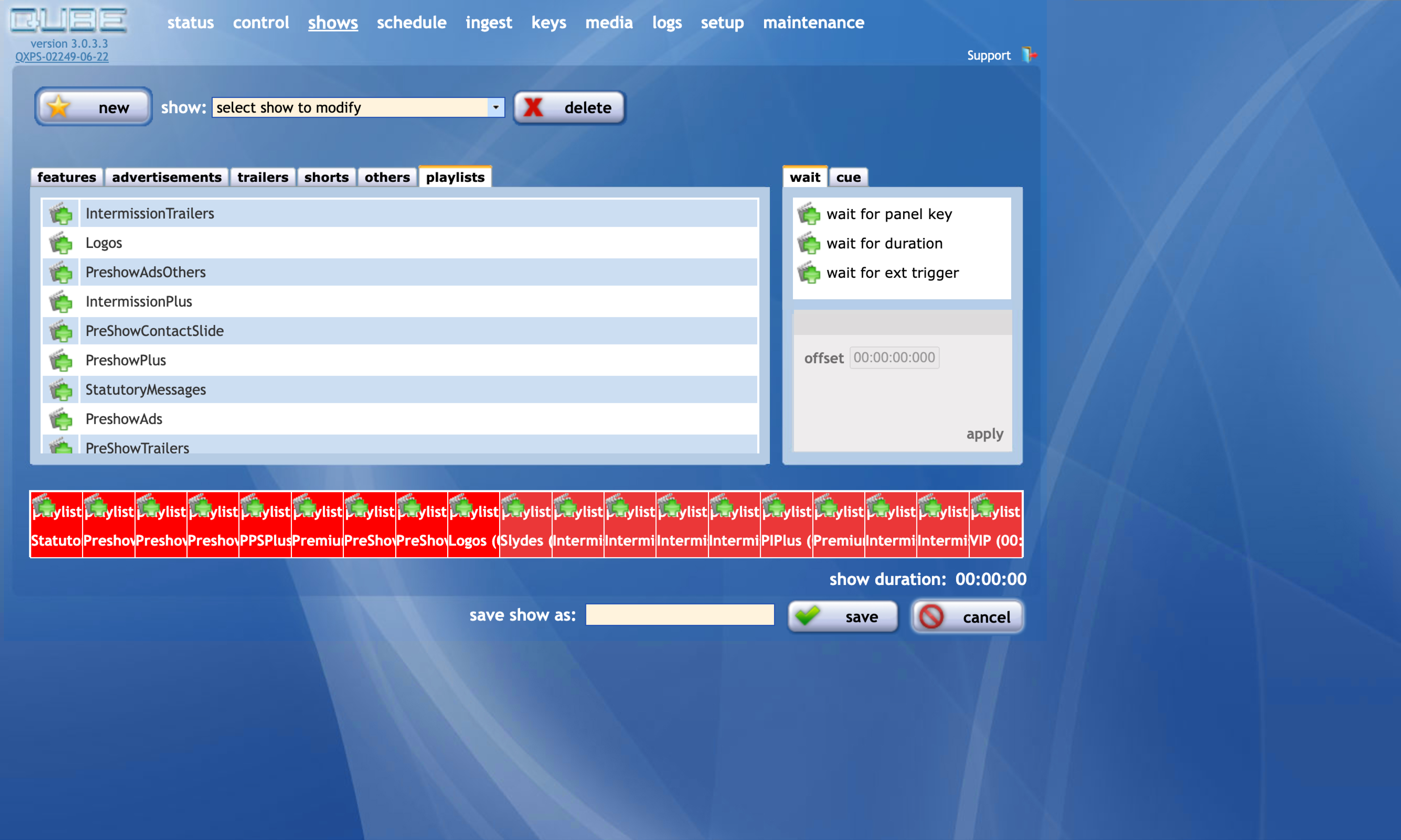
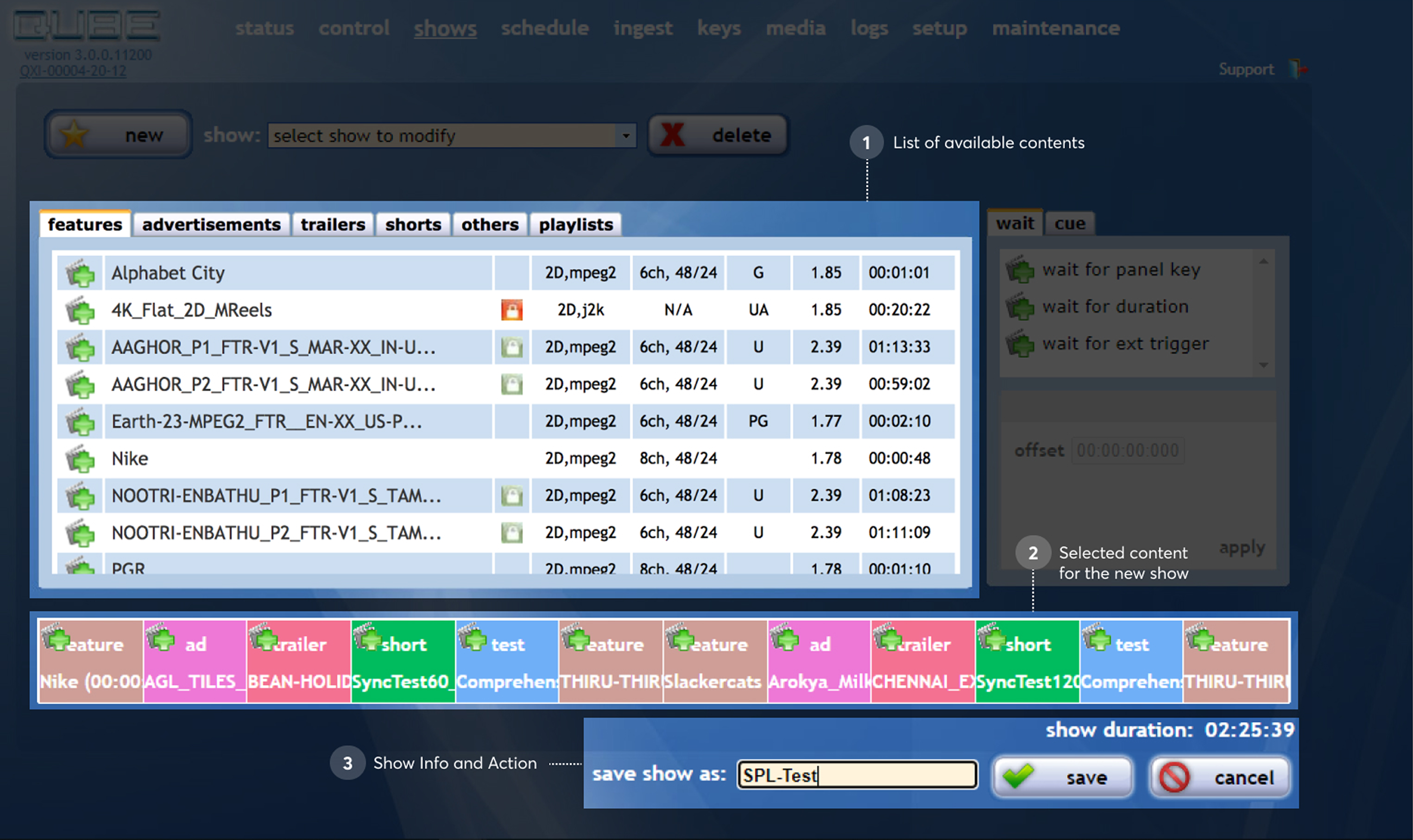
The interface was designed in 2005. After that, engineers added features as needed with no design oversight. It functioned, but it had accumulated years of patchwork.
Understanding the users
I worked from two sources: years of accumulated field feedback the product team had collected, and my own interviews with projectionists.
The operators ranged widely. Some were tech-comfortable, managing multiple screens. Others had been running projectors for decades and had a very specific, physical relationship with the controls. I needed to serve both.
What I designed
Dark mode as default. The projection booth is dark. The old interface was a bright screen in a dim room — I made dark mode the foundation, not an option.
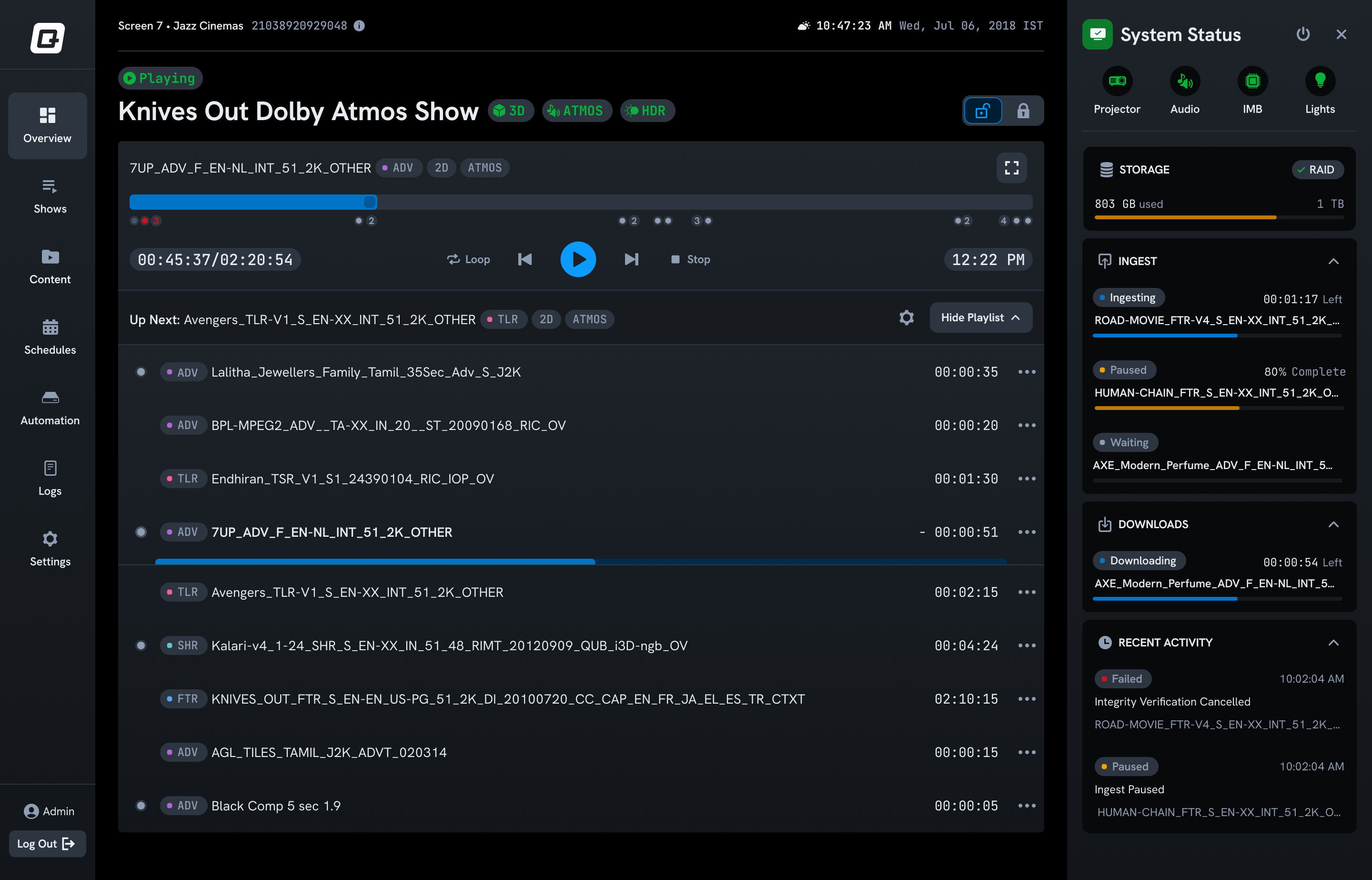
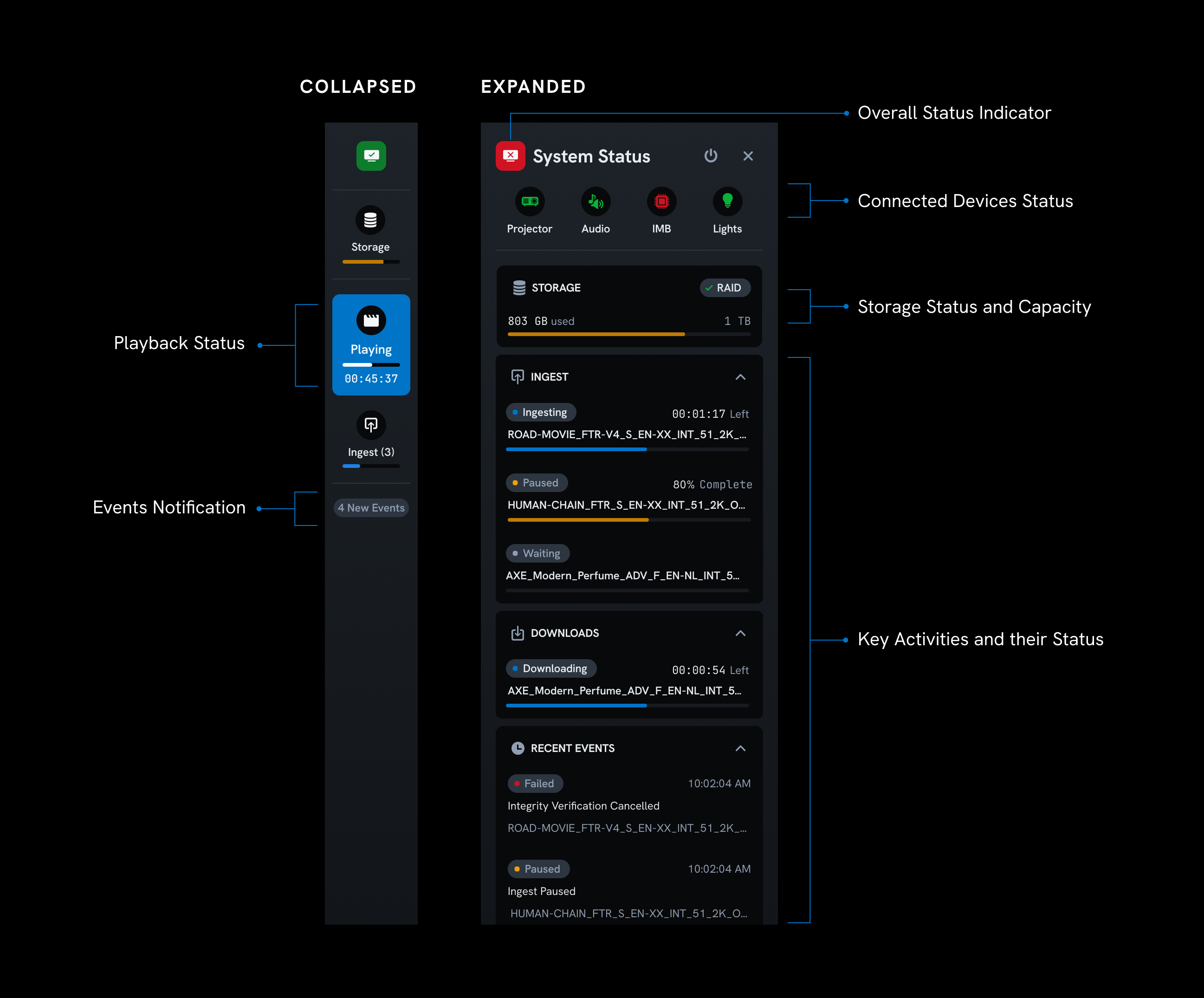
A dedicated system status panel. Projectionists need to know at a glance: is everything healthy? What's playing? How much time is left? I pulled this out of buried menus and gave it a clear, always-visible home. One of the most appreciated changes.
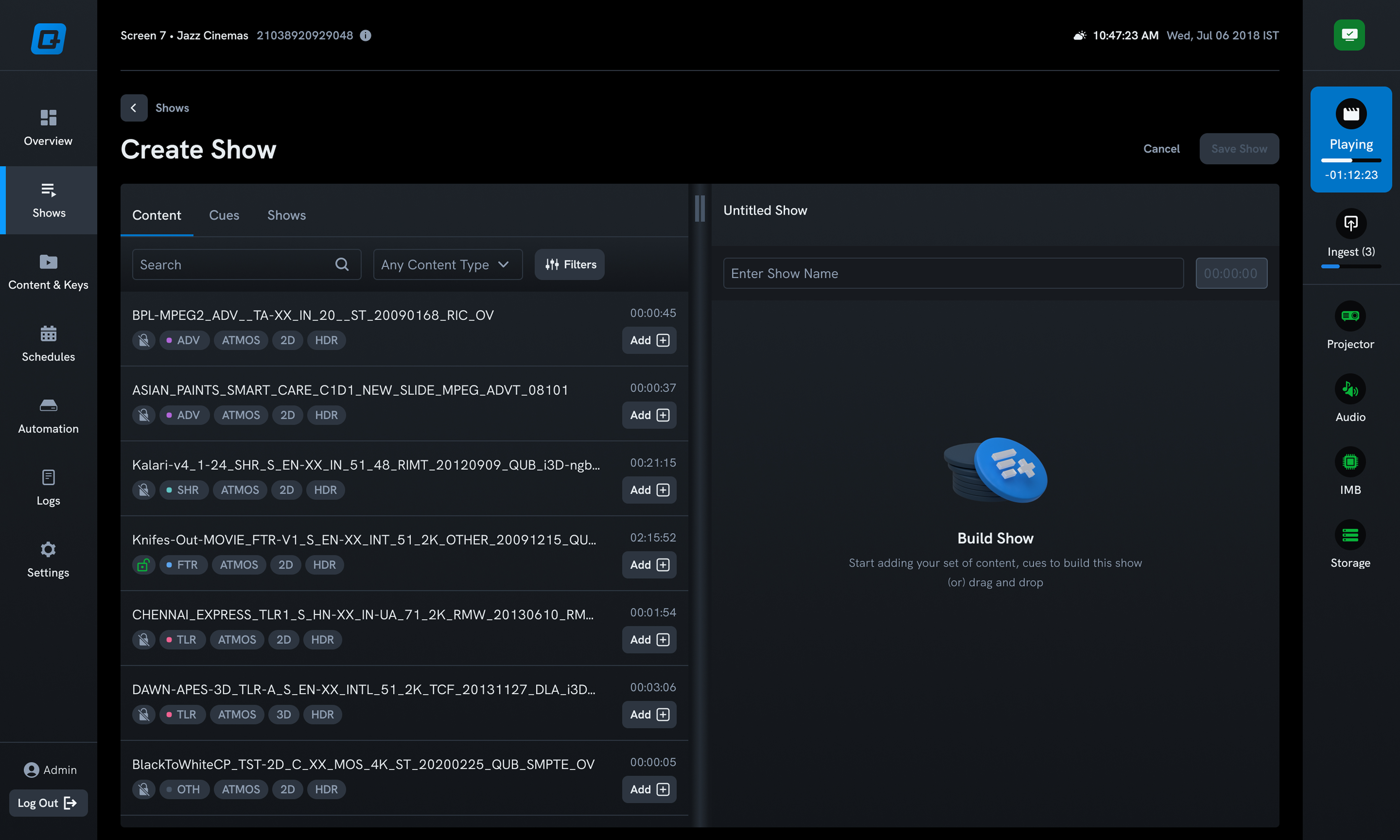
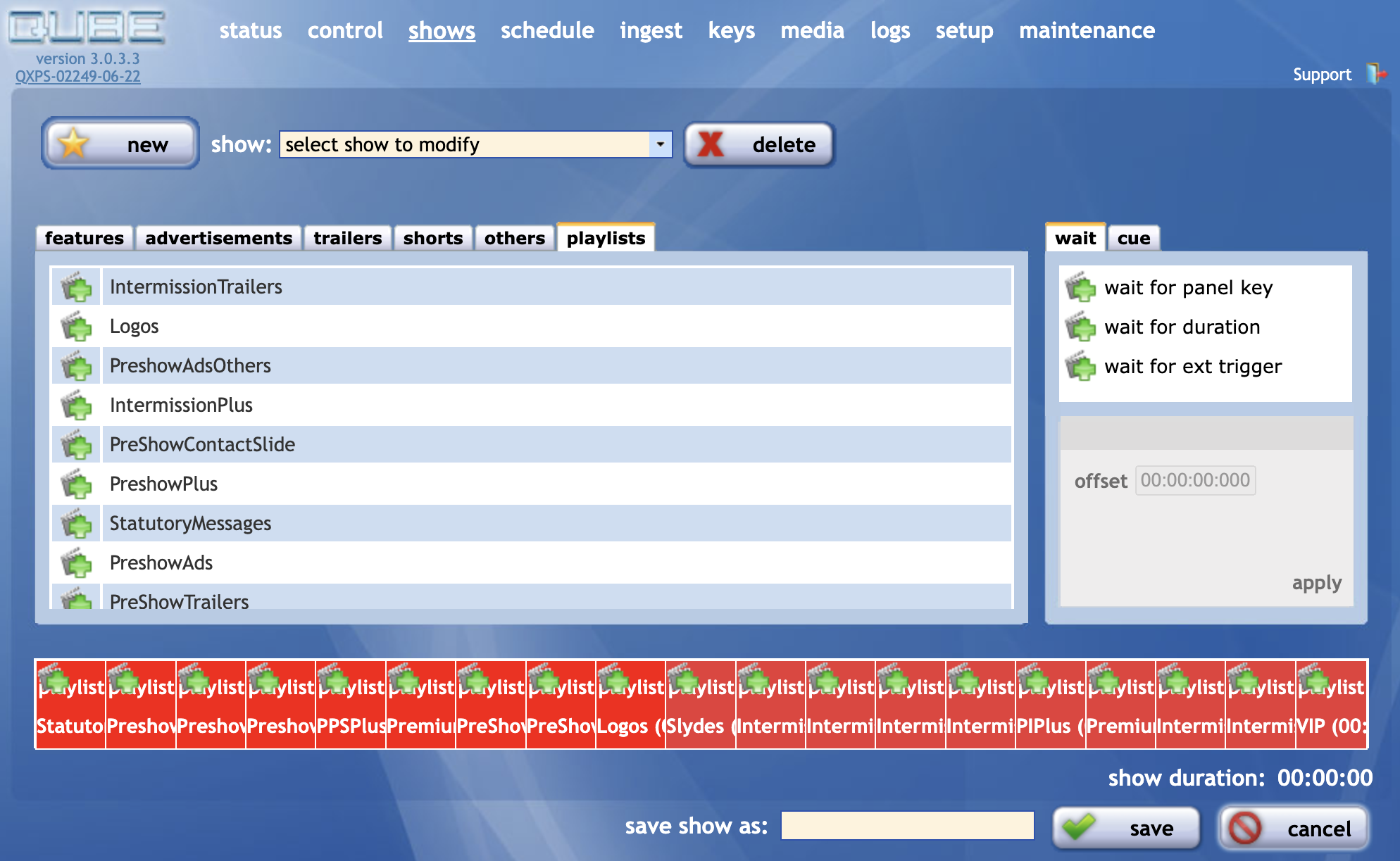
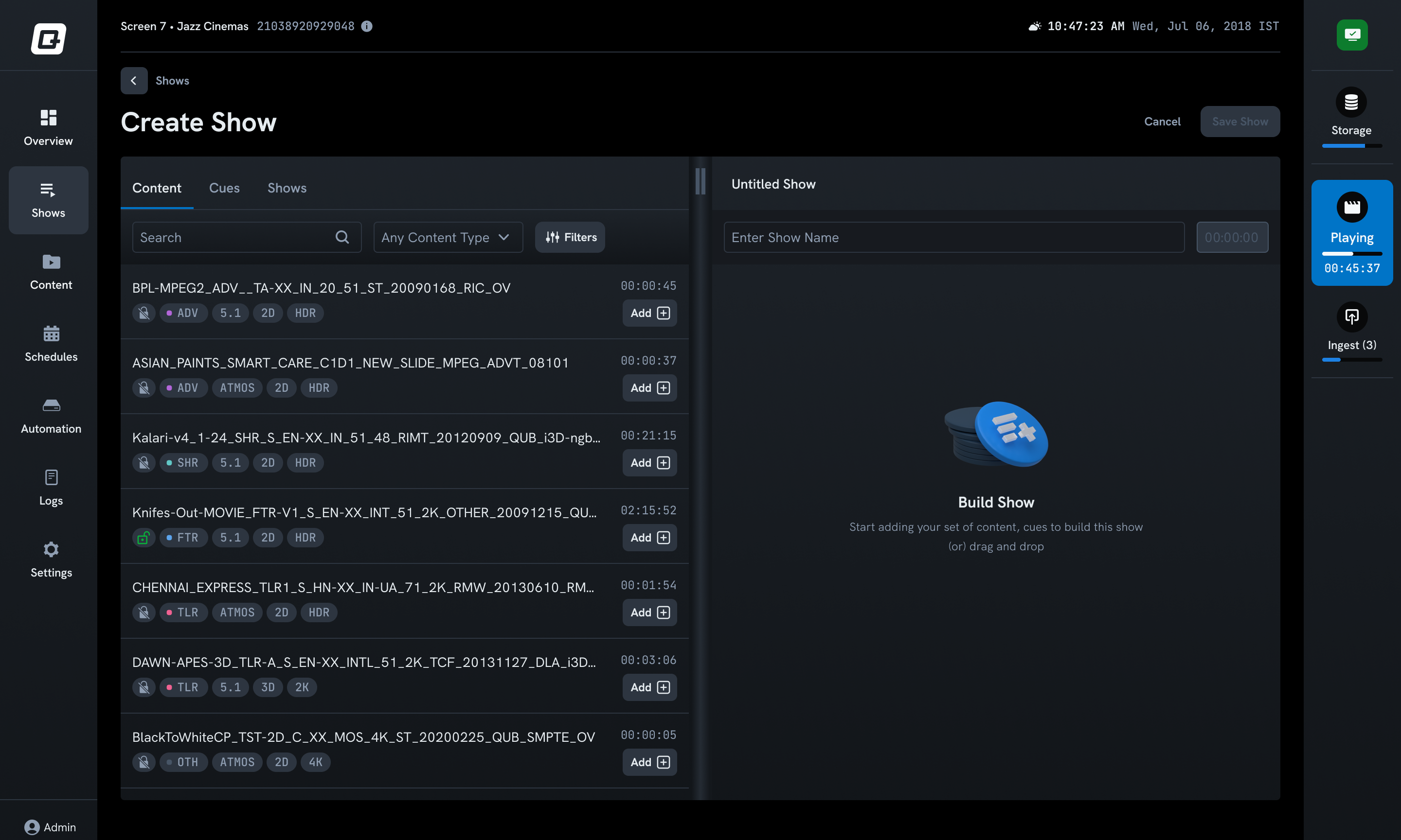
Simplified show creation. Building a playlist had grown needlessly complex. I streamlined the flow and improved clarity at each step.
Automated format tags. Digital cinema filenames encode format information that projectionists were reading manually. I surfaced tags (2D, 3D, Atmos) below each file so no one had to parse a name.
Standardized navigation. Years of ad-hoc additions had left workflows inconsistent. I brought everything under a coherent navigation and interaction model.
The thing I missed
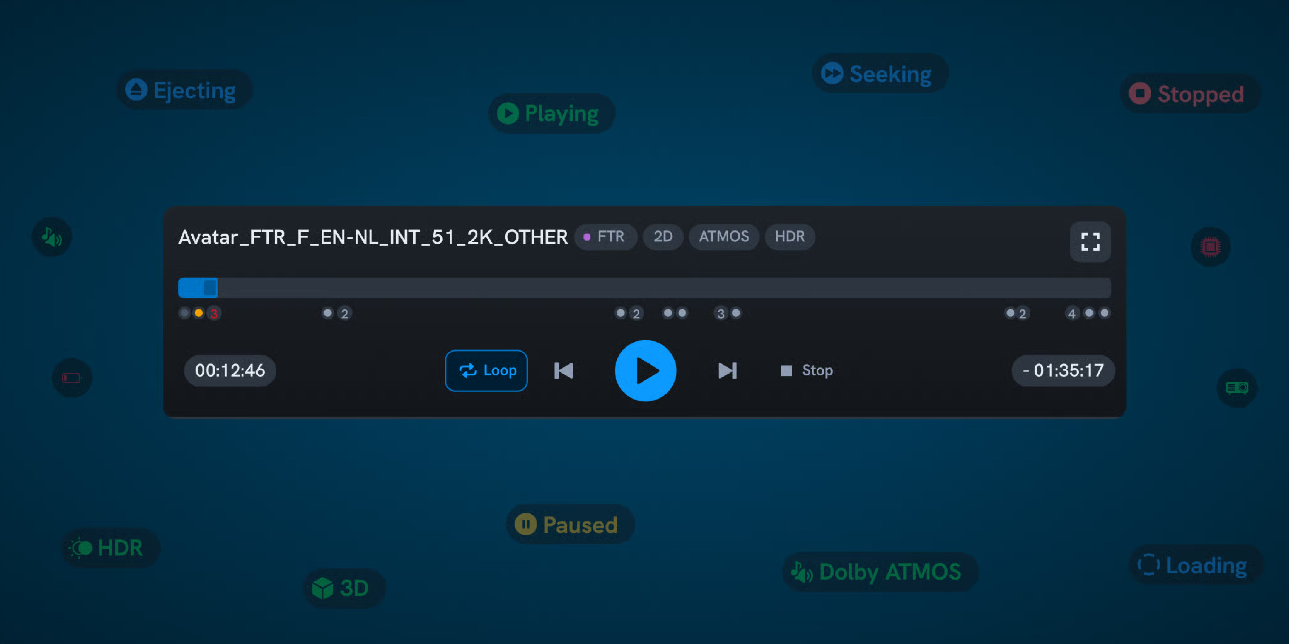
In the redesign, I replaced the old large play and stop buttons with a more "modern" control layout. The feedback was immediate: "Where are our big buttons?"
I'd underestimated how important they were. For some projectionists, play and stop are the only controls they use all day. For older operators, the large touch targets weren't a preference — they were a necessity.
How I fixed it
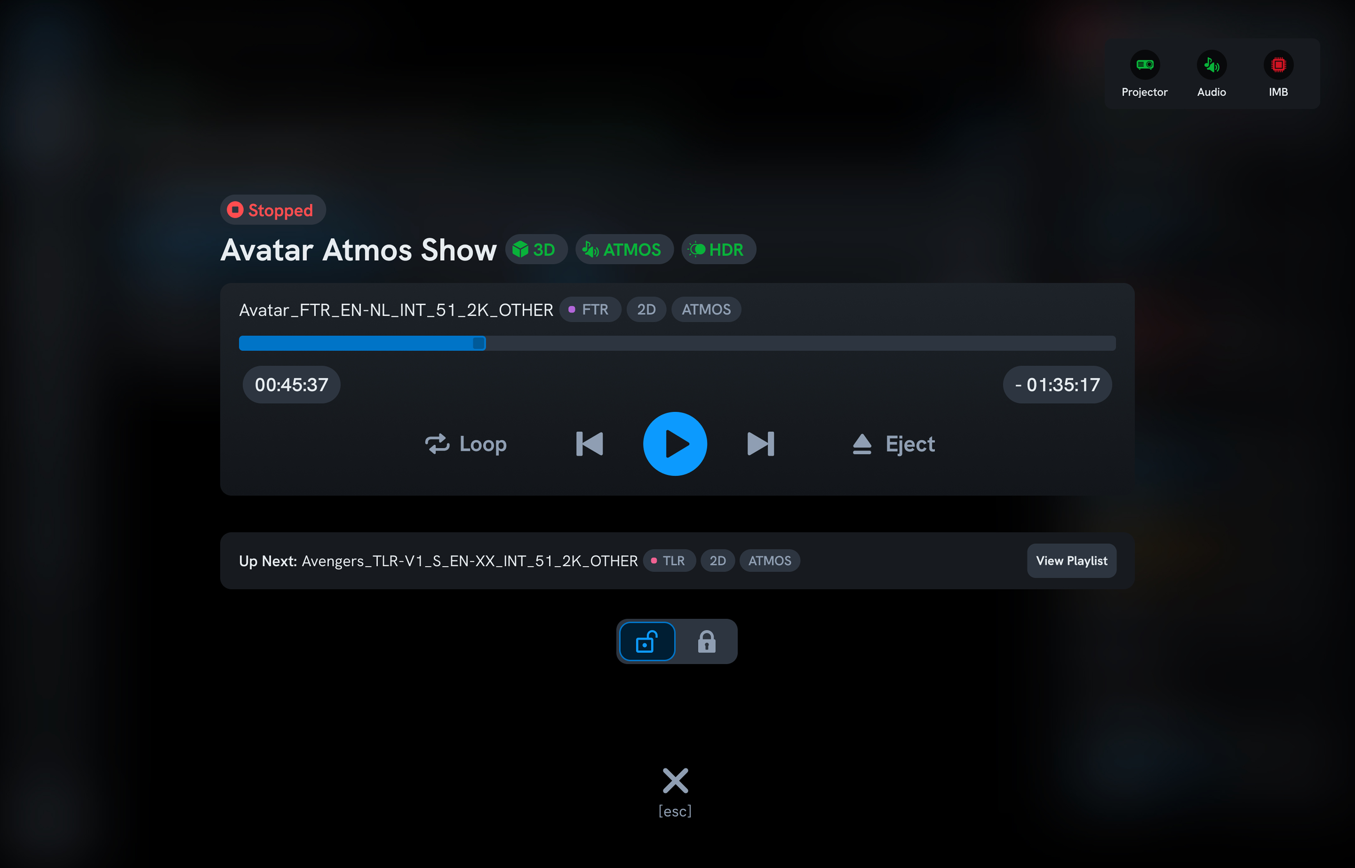
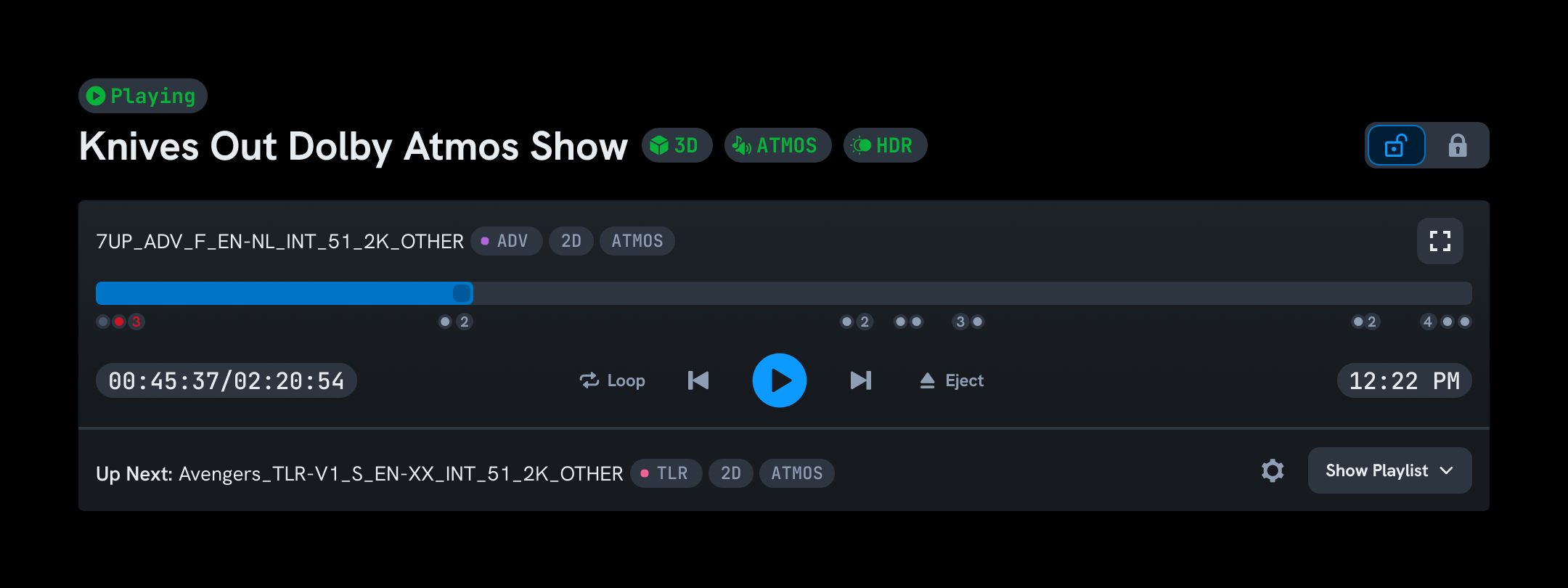
I built a dedicated full-screen playback mode with oversized play and stop buttons. Simple, focused, impossible to miss. Operators who need the full interface can exit the mode. Operators who just need to start and stop get exactly that.
A good reminder: in a redesign, the things users don't mention are often the things they love most. You only hear about them when they're gone.
Results
- Scheduling became 2x faster for projectionists
- Full-screen playback mode became the most-used feature among projectionists
- 40% fewer errors by adding content format tags and always-visible system status
Want the full story — the 5-year timeline, the show-times complaint, the post-launch research?
The people who run every show
In every cinema hall, a projectionist sits in a dark booth and controls the entire experience: lights, audio, projector, and automation sequences. They use a single web interface running on a local server. That interface is Qube XP.
Qube has a near-monopoly in India. Advertising, analytics, and content delivery all run on top of this product. It was the company's first product and remained the foundation everything else was built on.


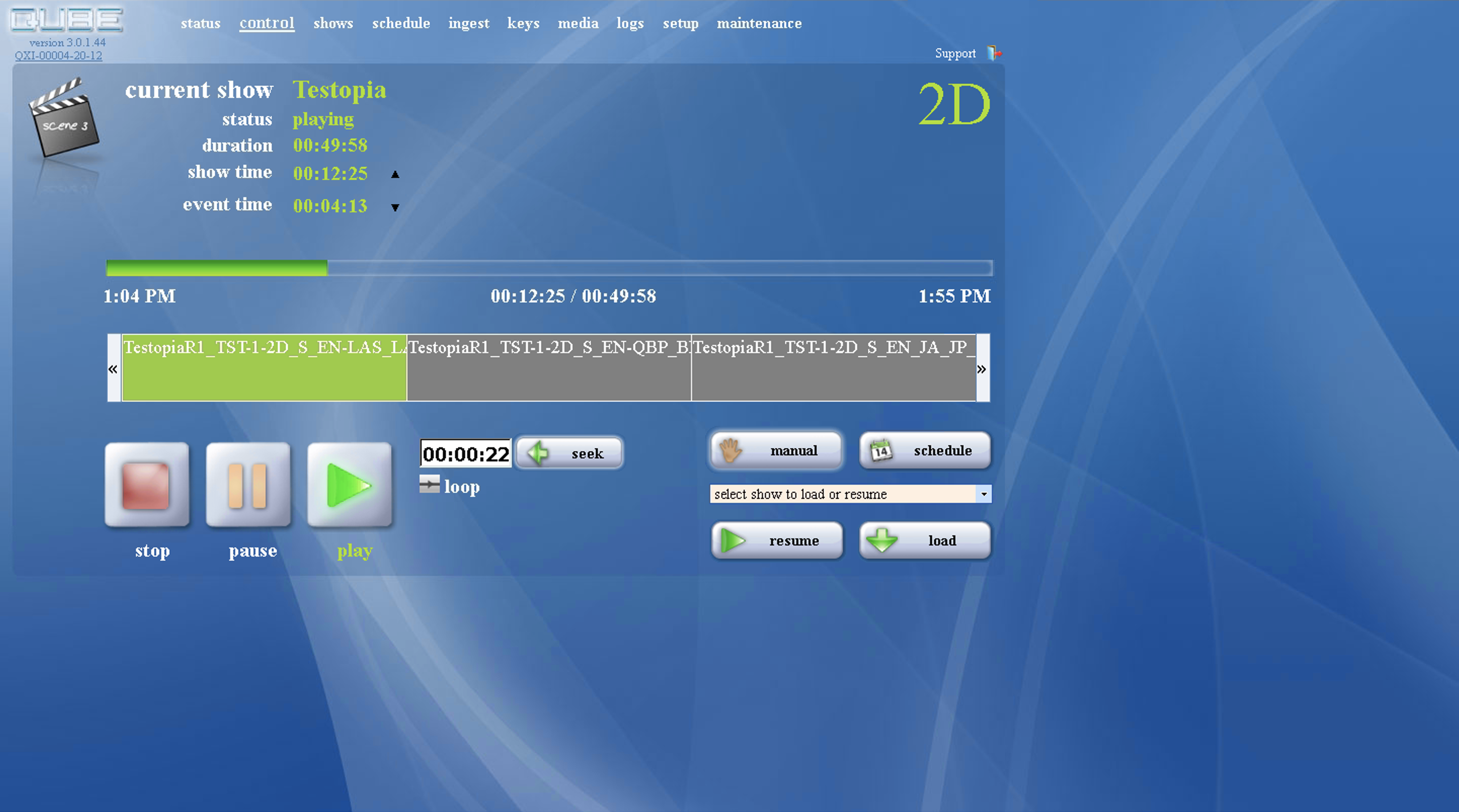
The interface they were using
The same UI had been running, mostly unchanged, since 2005. Features were added directly in code as the product evolved, with no design oversight. It functioned — but fifteen years of patchwork had stacked up.
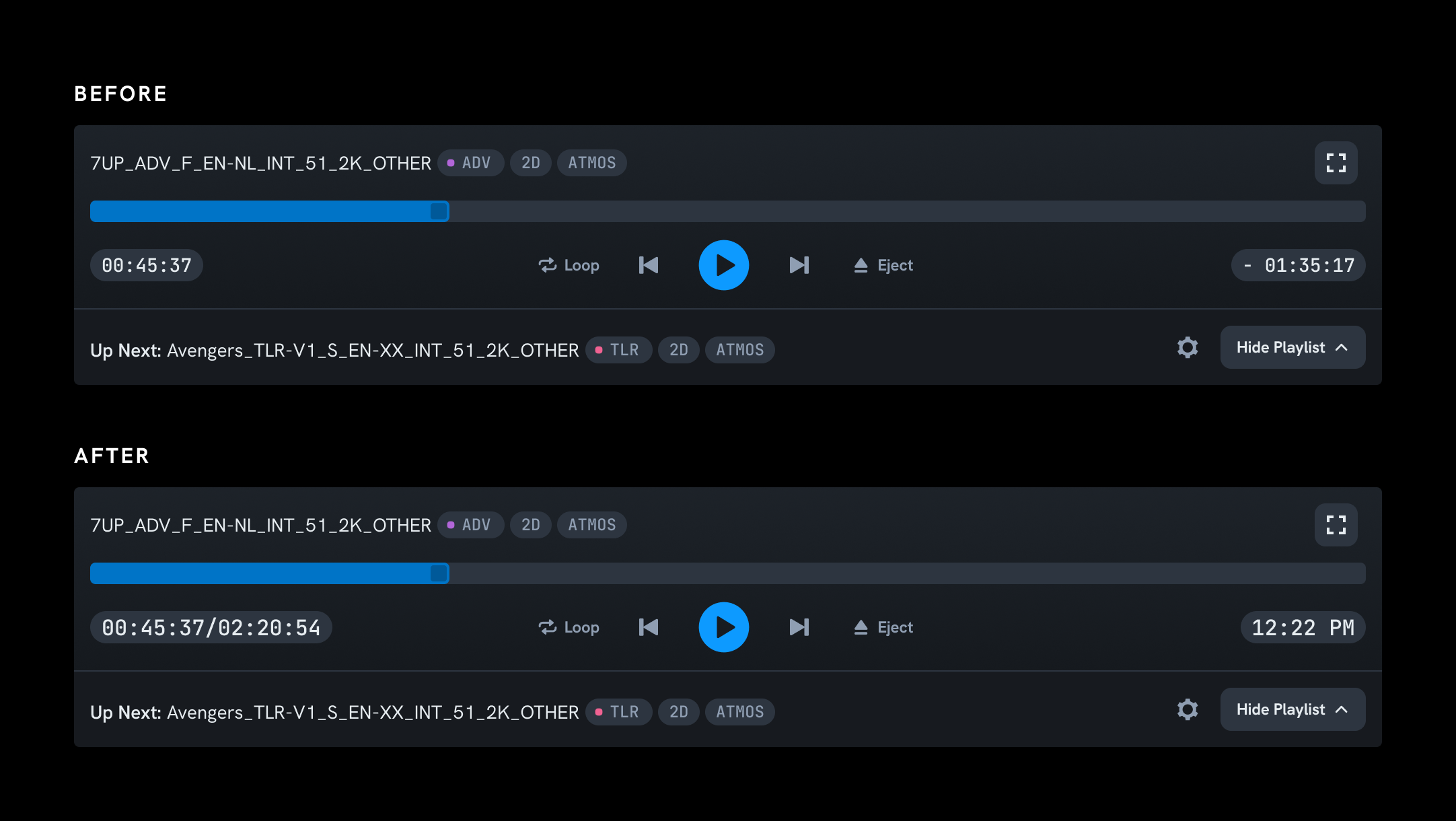
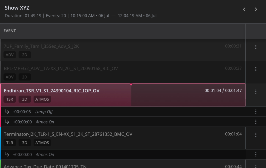
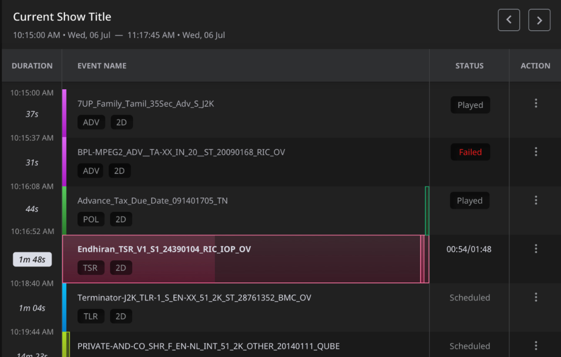
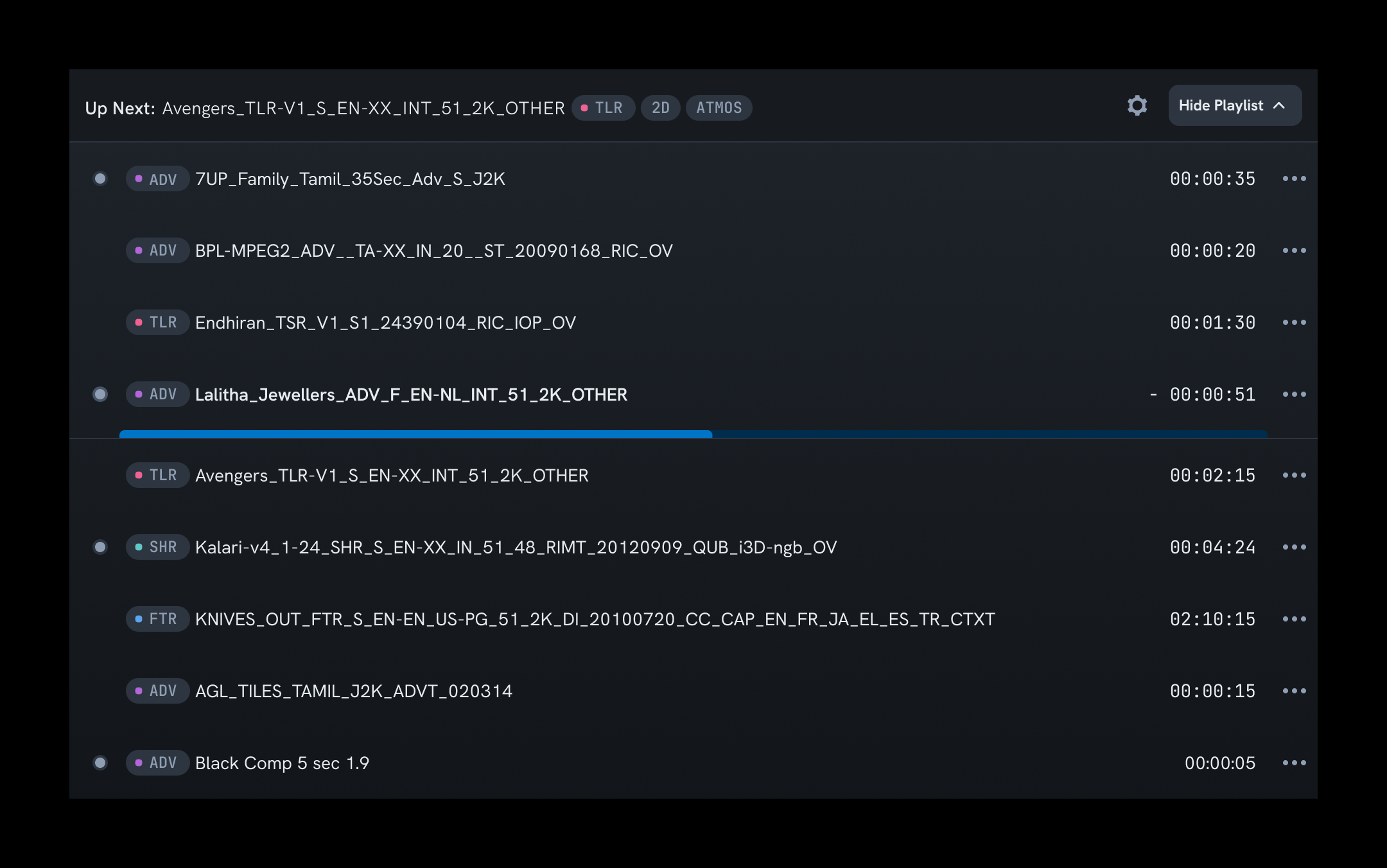
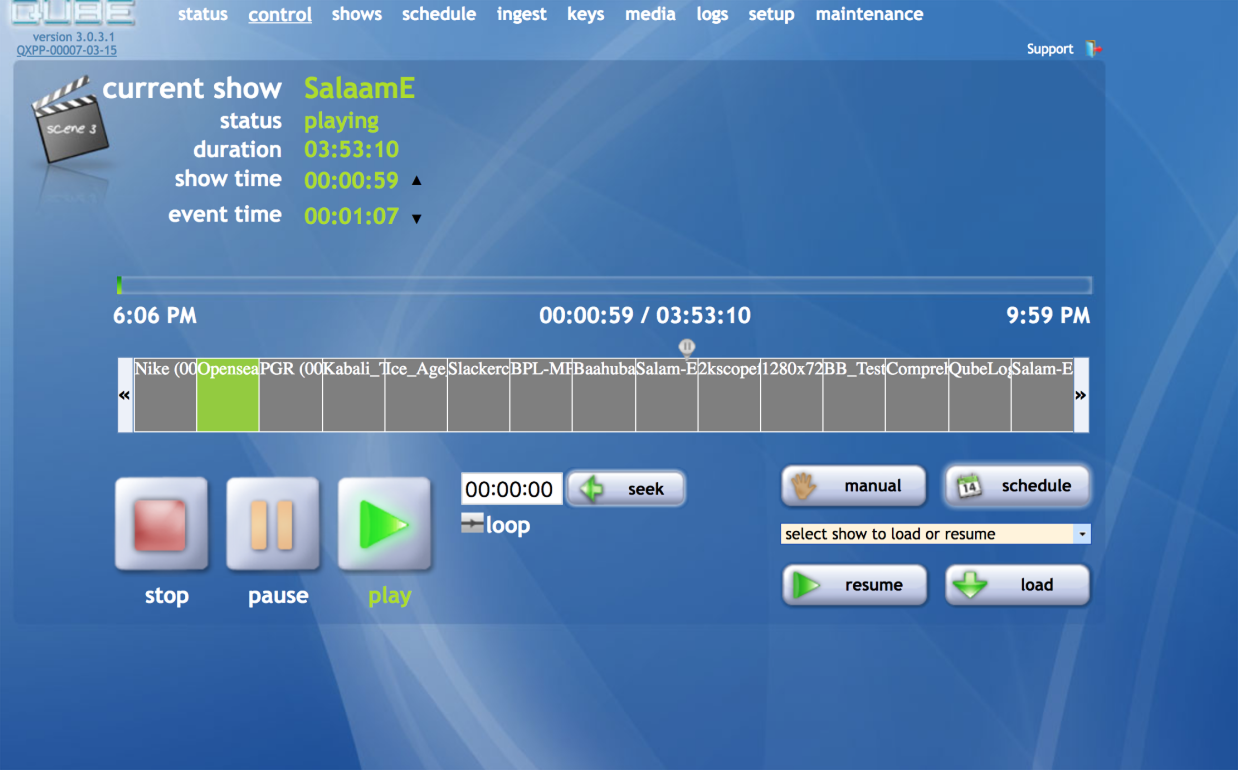
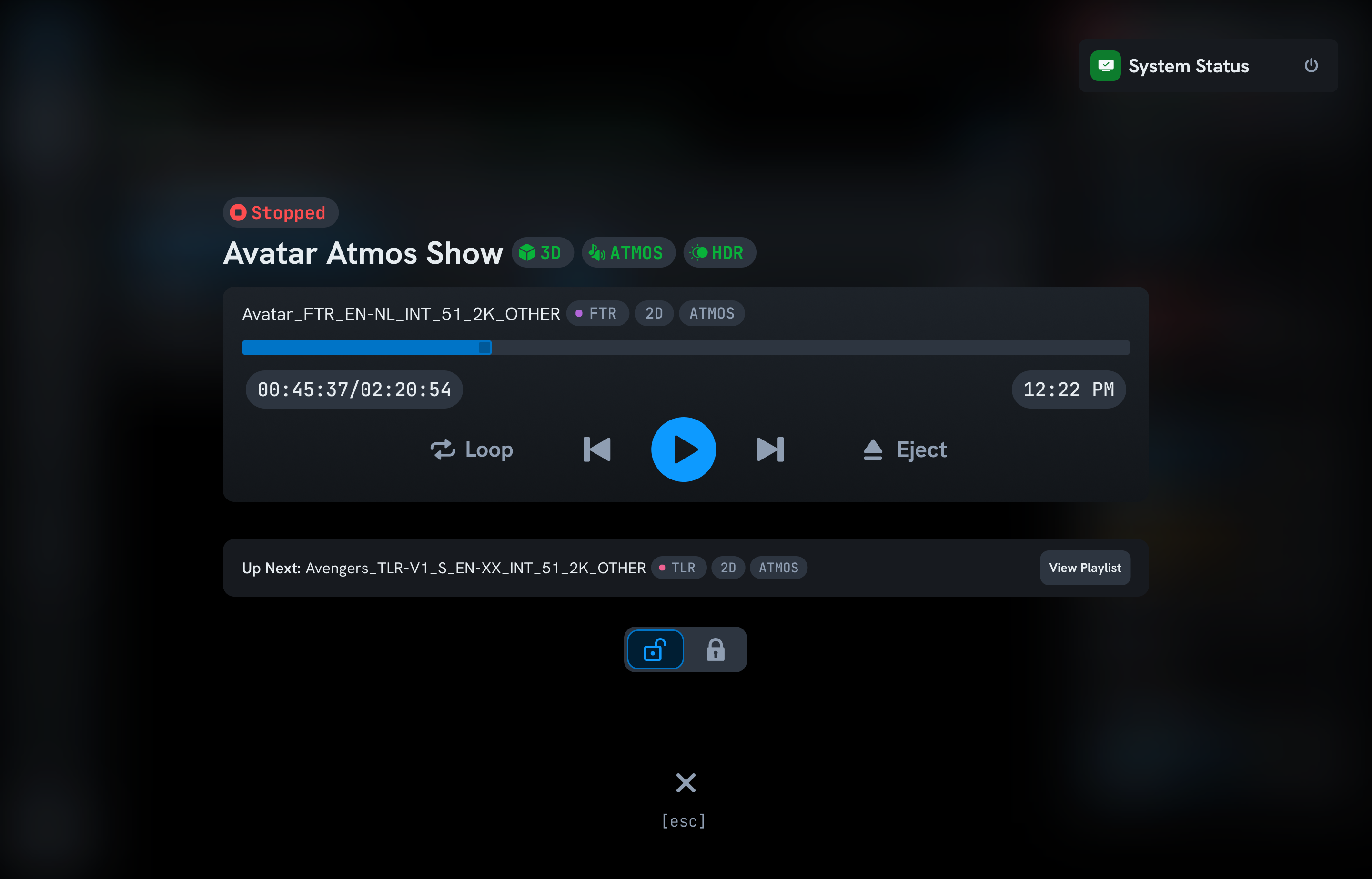
Playback Control
The most important screen in the system. What happens here is felt by every person in the cinema hall. The old design had no clear visual hierarchy. Controls were spread apart and repeated, and the playlist was too cluttered to scan quickly under pressure.
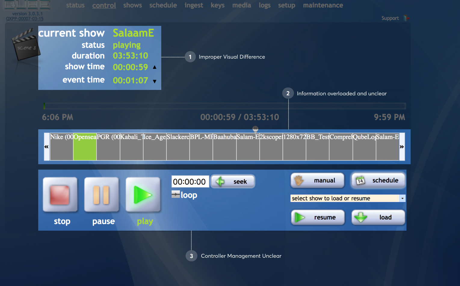
Exploring the playback controller
I ran several explorations for the controller layout. Each iteration tightened hierarchy, collapsed redundant controls, and gave the currently-playing content the visual priority it deserved.
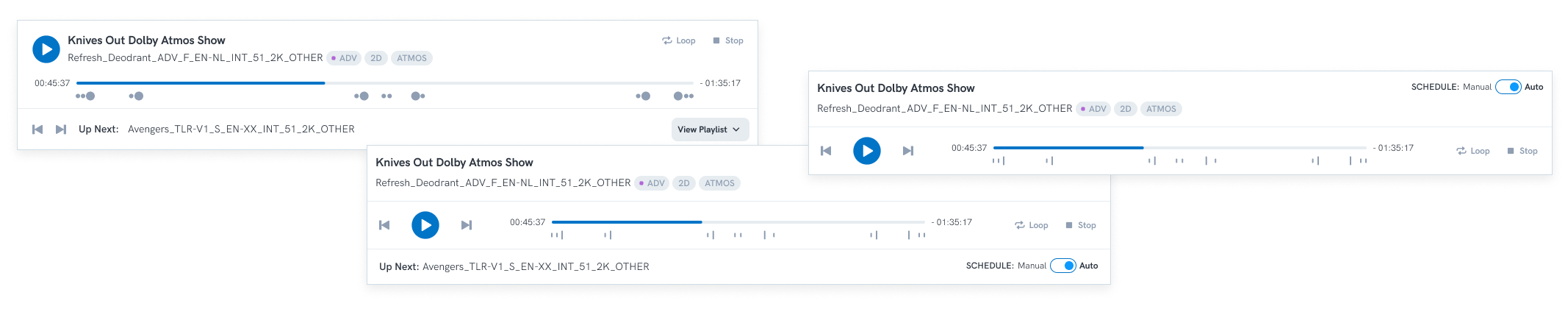
The final player bar
Progress, transport controls, content metadata, and next-up — all legible at a glance, from across the booth.
Show playlist: exploring the layout
Several layouts were tested for how selected content should sit inside a show — balancing full CPL names, tags, and durations with space for long playlists.
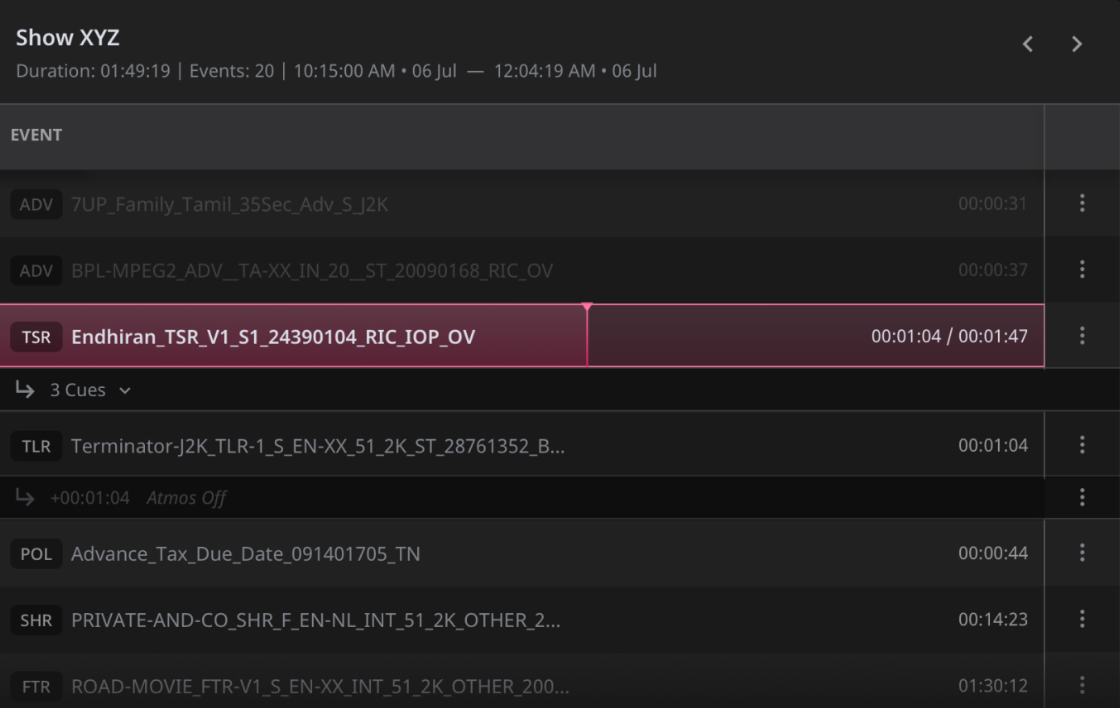
The final show playlist
Full CPL names, tags, and durations side by side, with a resizable divider so operators could give whichever column needed more room.
Playback: before and after
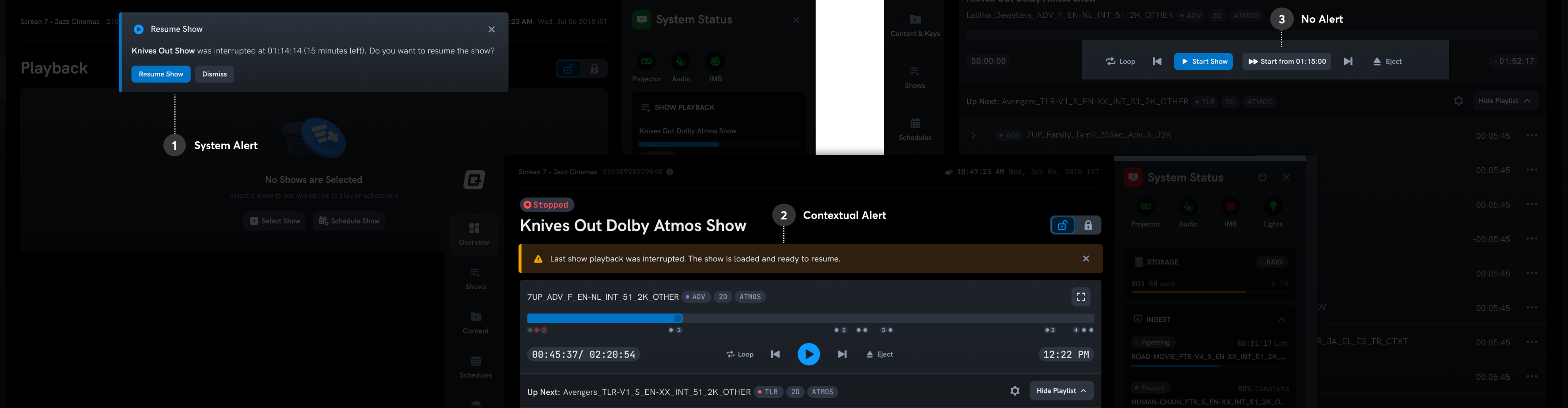
Challenge: power failure during a show
This came from the support team and the product backlog. When power fails mid-show and the system restarts, where should playback resume? We explored three approaches: a system-level alert, a contextual alert anchored to the playlist, and a silent mode with a "resume from here" button.
The contextual alert won. It was explicit enough to surface the interruption without taking control away from the projectionist. The play button stayed exactly where they expected it. The system auto-seeked to 5 seconds before the point of failure, so they could verify the frame before continuing.
Shows page: before and after
Collapsed & expanded states
Each system is a self-contained module. The structure was approved in the very first review. We spent the rest of the time refining the visual treatment.
Going to the field, finally
Once deployed, I pushed for the research we couldn't do at the start. Visits were planned at two specific intervals to separate initial resistance to change from genuine product feedback.
in Chennai
interviewed
field visits
days 2–3 and month 1–2
“Where are our big buttons?”
I adopted compact media player controls, assuming the mental model from streaming apps would carry over. It was the right instinct for the wrong audience segment.
Many projectionists were in their 50s and 60s, in dark rooms, on older monitors. Some only play and stop shows all day. They needed large, unmistakable controls.
A dedicated full-screen playback mode with large controls. Simple, focused, nothing to hunt for.
“Where are my show times?”
I removed start and end times. The technical reasons felt solid: time drift, dynamic ad durations, wait cues. I let implementation complexity drive a design decision.
Every projectionist brought it up. They manage intermissions, food stalls, and crowd flow across multiple screens. "Even off by 5 minutes, we just subtract." Absence was the problem, not accuracy.
I was solving a precision problem they hadn't asked for. They needed a coordination tool. I brought it back.